CMS is one of the top 10 global law firms and is one of the largest international legal and tax service organizations in the world.
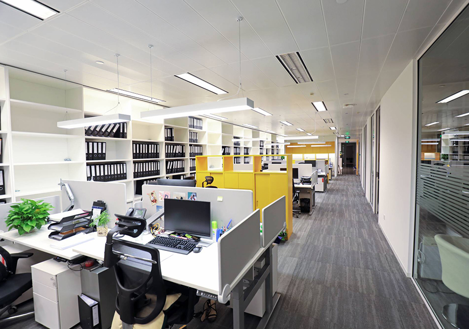
The company headquarters is located in New York, with one of its branches in Shanghai. The design brief is to give CMS a vibrant and positive image and be seen as a place where people belong, grow and thrive. The design's use of the classic but cool monochrome of black and white is balanced by warm touches of yellow. A light plane, created by the combination of parallel styling blocks and a modern minimalist chandelier, adds a vertical brightness to the room, while the open space is clearly divided through the ingenious use of lighting and linear carpet patterns. To partition the room, yellow multi-purpose cabinets are used to delineate each space without adding unnecessary heft and weight.
The manager's office is located in the center of it all and features a bright and open layout. Both the ceiling and the 3D bookcase are designed to be square, to add a dimensional layering effect to the room. To make sure that there is sufficient lighting in the room and to give it an illusion of space, transparent glass is used on the side by the door. Simple lines are used prominently in the conference room, which was designed with a simple yet modern look in mind. The lights create linear shadows that are similar to the wood grain patterns on the floor, which ties the room together, while also lending the room a soft and natural feel.
This softness reduces the tension that often arises during meetings. However, as it is still a conservative space, stark black chairs are used, which grounds the lightness of the surroundings and lends the room a straightforward, no-nonsense character.


