Logitech is a leading software and computer hardware manufacturing company with headquarters in Switzerland. The company’s office in Shanghai is designed by EDS Interior, and the project is dedicated to creating a high-end space that abandons all aspects of traditional office design. In summary, the goal is to create a natural and comfortable office environment.
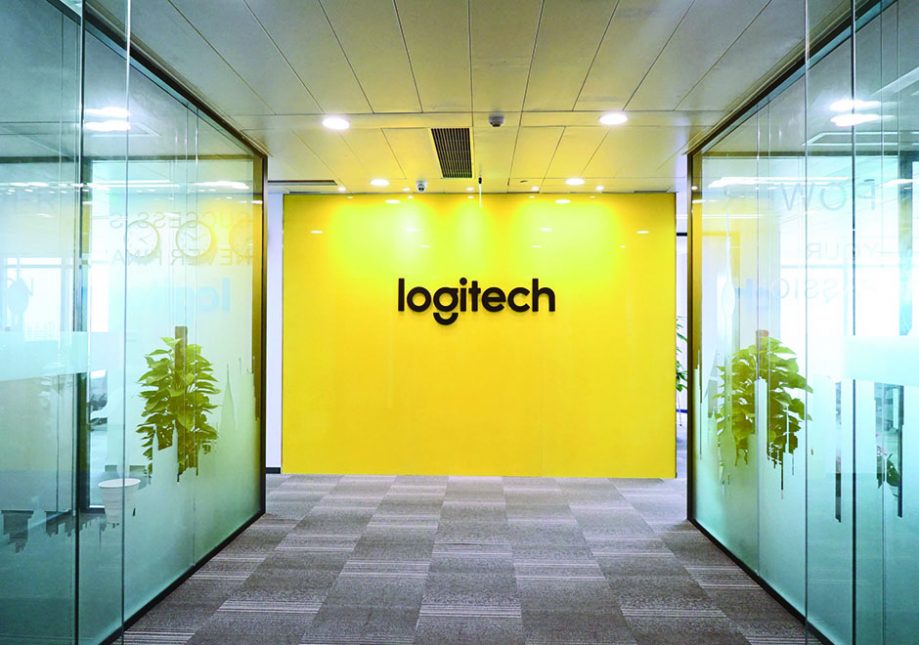
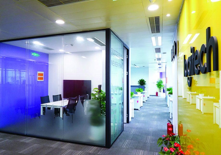
The designer put a lot of effort into the logo hung against the wall. Yellow is a color often associated with brilliance and the sun, and this subconsciously gives people the feeling of being illuminated with the light of wisdom. This gives visitors a good first impression of the company upon entering the lobby.
The design brief is human-centric, as the design brief takes into priority elements of good health, energy efficiency and the presence of sunlight. A moving line between the entrance areas helps create both a buffer and a visual connection within the space, while using glass doors and beige acrylic panels give the area a warm and harmonious tone.
In front of the bright wall is a small conference room with an all-glass partition. The main purpose of this partition is to create an independent conversation space. This layout provides the respect of privacy with a quiet but warm space for those taking part in a closed conversation.
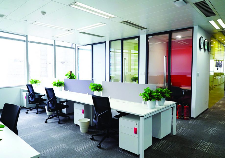
A short distance from the small conference room is the public office area. The designer placed the moving line in the center area of the left and right spaces. The advantage of this is that the space will not appear static. The edge of this space was the most challenging area to use in the layout, but the design issue was resolved through the ingenious use of space integration.
Black office chairs, white desks and walls make the space bright, while soft lavender-toned partitions and green plants allow nature to enter the space. The gray carpet contains small elements of white, opening up the entire area.
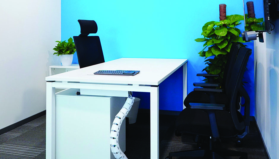
In the manager's office next to the office area, the designer takes into account the relationship between the individual and the entire macrocosm of the company. The designer also takes note of the manager’s personality and temperament in designing this space, without allowing it to deviate from the rest of the office.
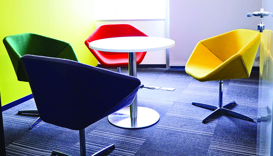
The designer places the negotiation room on one side of the space, which can open up more room and give employees more areas to relax. The diamond-shaped chairs keep the space from looking dull. These chairs not only serve as a visual element but also a possible conversation piece that deepens the friendships and quality of communication among employees.
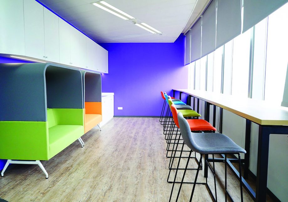
The open rest area allows employees to interact with each other more often at work and increases the company’s momentum. For employees who wish to have some space, the designer has also created a bar where they can read books and find peace within a busy day. These elements all come together without wasting any bit of space within the area.
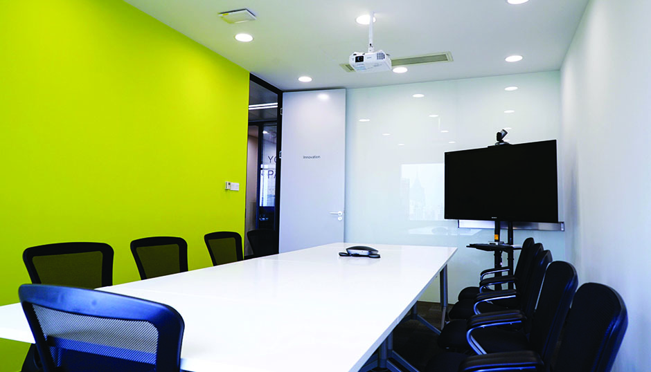
In the design of the conference room, the designer gave full play to his advantages in the design and provided a solid foundation for the fused space.
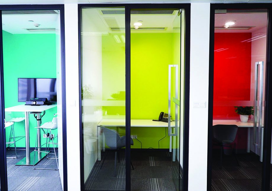
The telephone room divides the entire space into two with a movable panel, showing the charming functionality of a room that has the ability to be divided into two. The sliding door is like a key, one that opens and closes a space.
Throughout the office, the designer made full use of every space. Not an inch of space is wasted, as every bit of it has purpose and value, whether filled with the furnishing, or left blank on purpose.
